I bought this from the library several years ago, and found it during cleaning/disposing, and decided to study its design and writing. After all, we could benefit from professional guidance – but since we cannot afford it, we can reverse-engineer/reverse-design a billionaire’s publication.
Since I’m not of the “Bloomberg class”, and not interested in capital, I didn’t know what this was.
My impression: they tried to give a neutral/economically liberal overview of a topic that emerged or was trending in the news. (I believe that’s Bloomberg’s trade – news terminals.) The magazine had a few interesting formats.
The table of contents was lean and spacious, with titles grouped by category (as was the entire book).
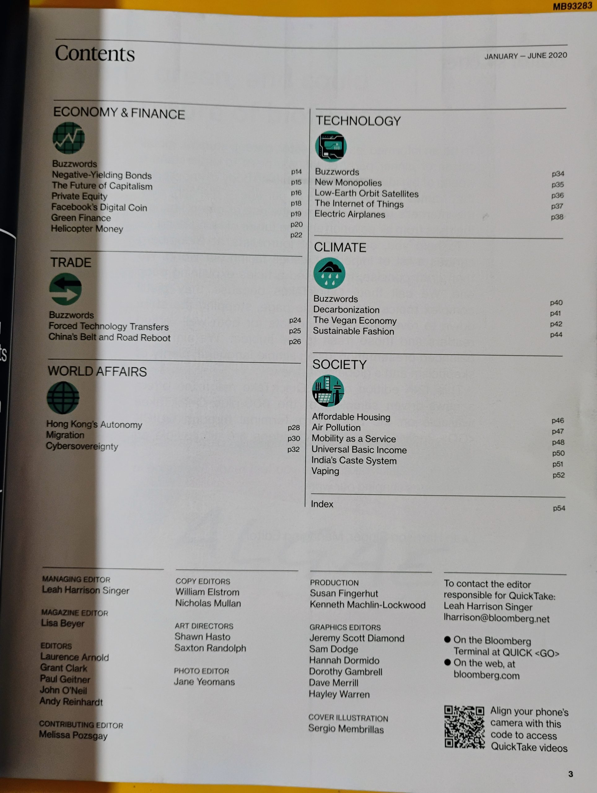
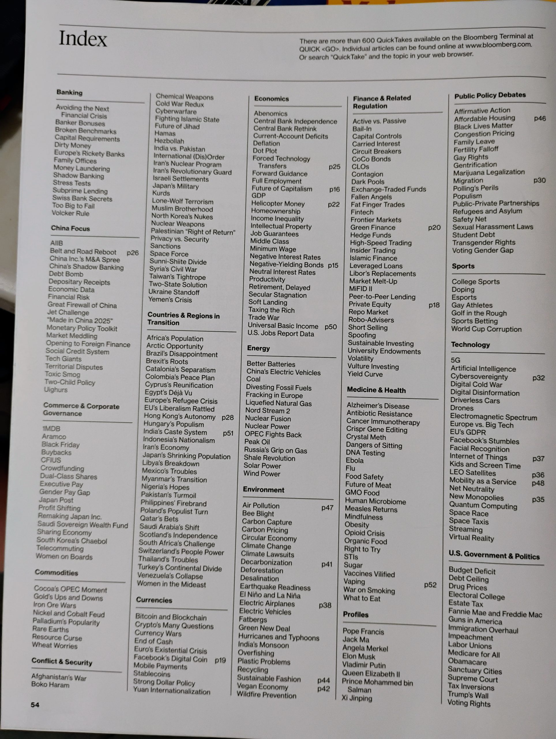
An index, which listed all the topics they wrote about, was in the back.
In each category, they had brief explainers about buzzwords, around 220 words long.
Then, within each section were 1,000 word explainers. (In the old days, we called this “four double-spaced pages typed”. Broadcast speech is paced at around 250 words per minute.)
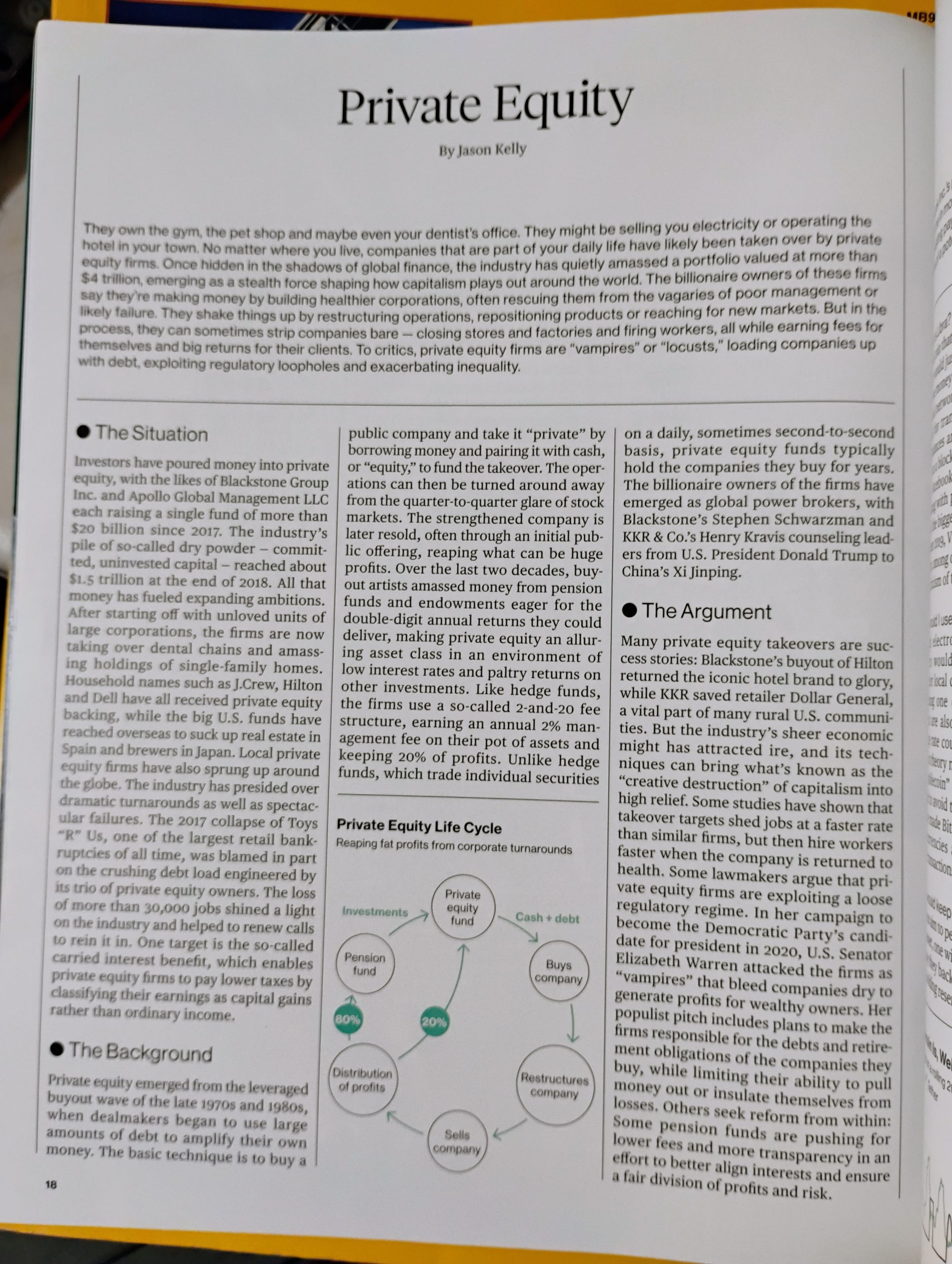
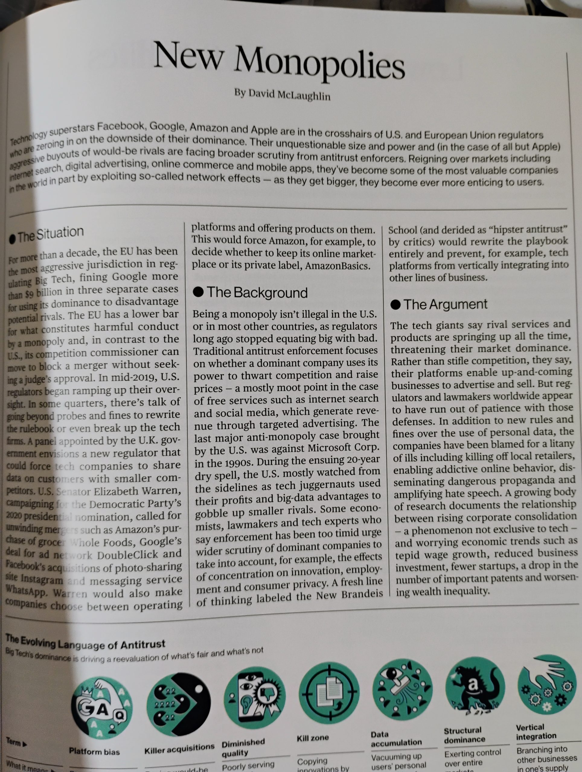
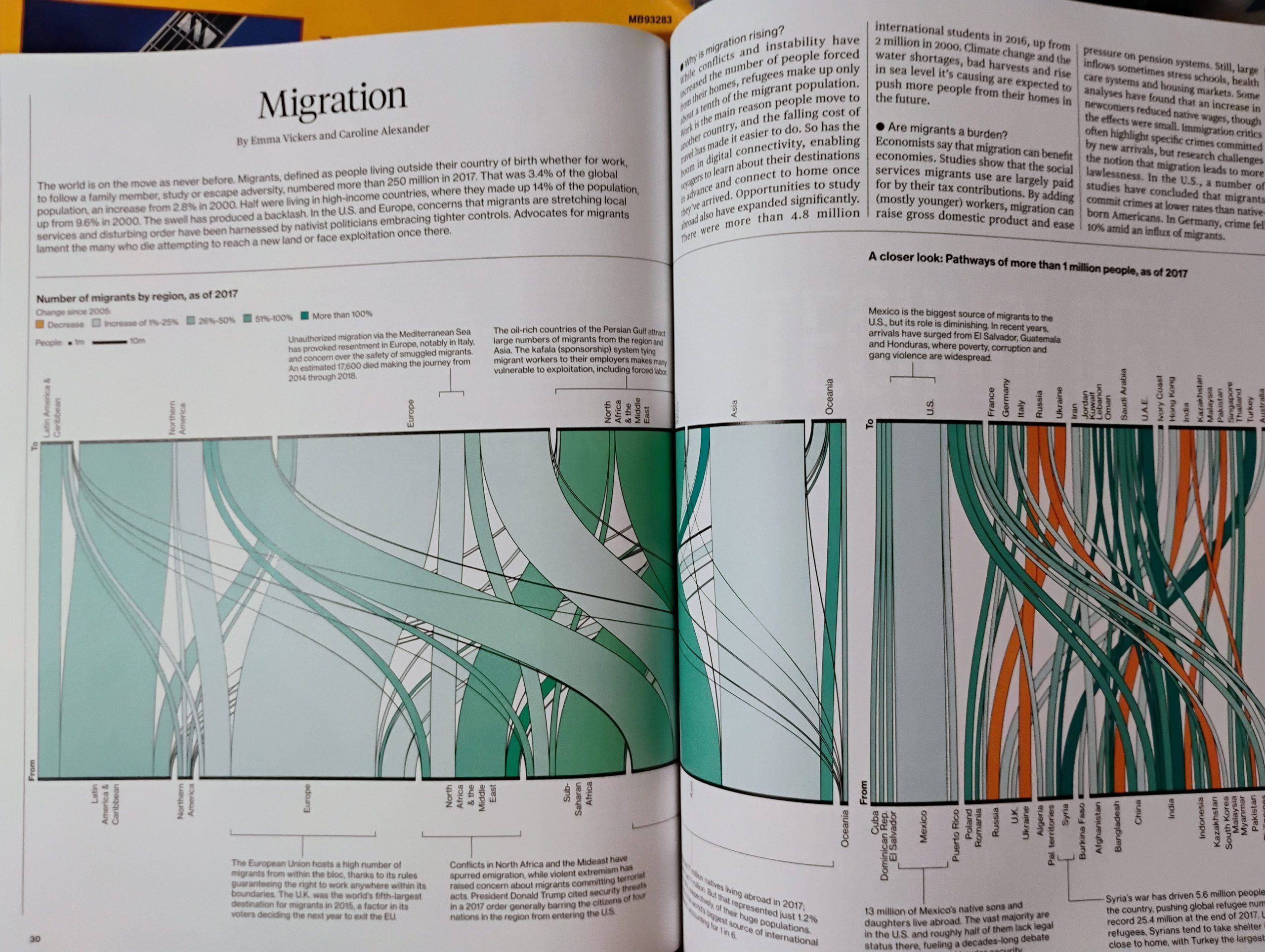
They used complex infographics.
The three column layout produced a column that’s around 6 words per line.
This was slightly wider than my mobile phone at font size 3, which gave me around 5 words per line. (I often enlarge the font for around 4 words per line.)
They didn’t use paragraph breaks.
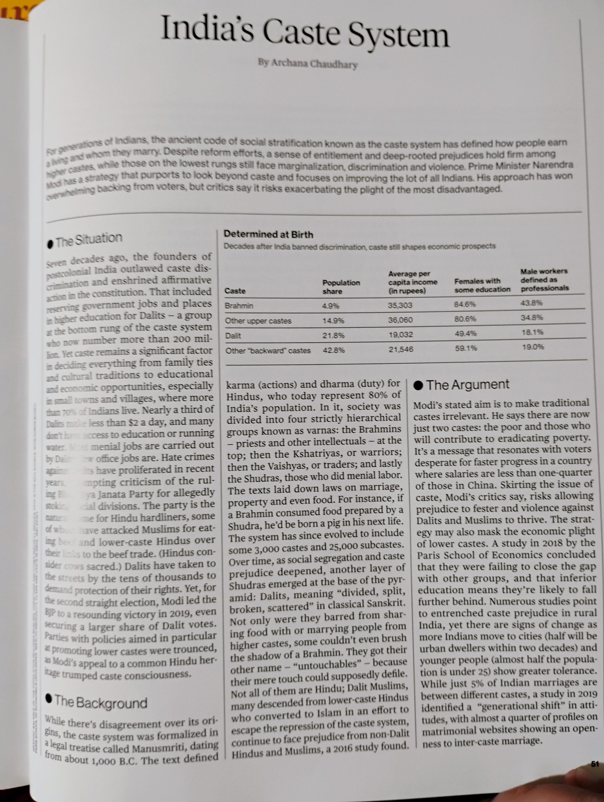
Some of the explainers were divided into three sections: The Situation, The Background, The Argument.
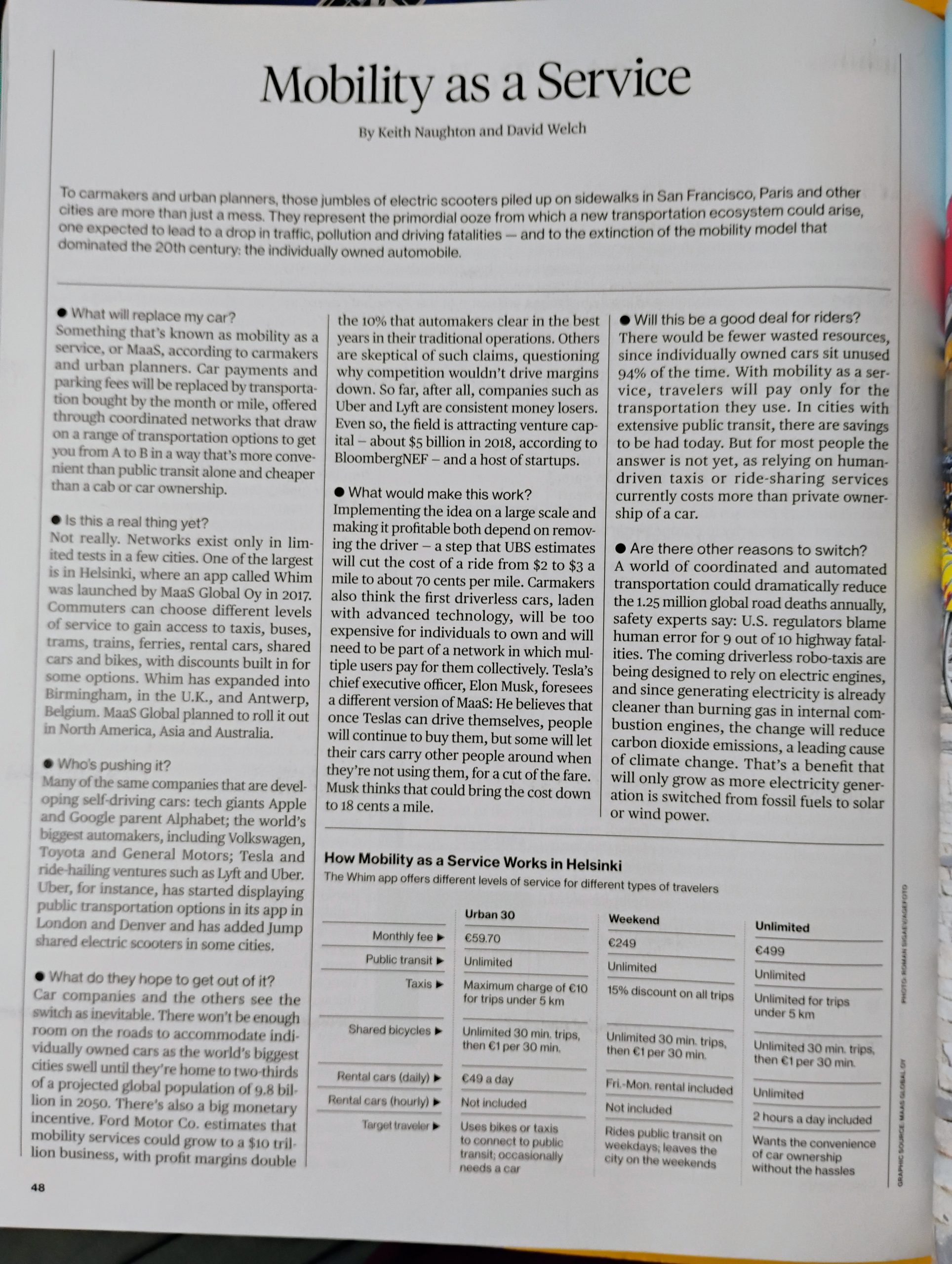
They also used a Q&A format to explain Mobility as a Service, a forward looking subject.
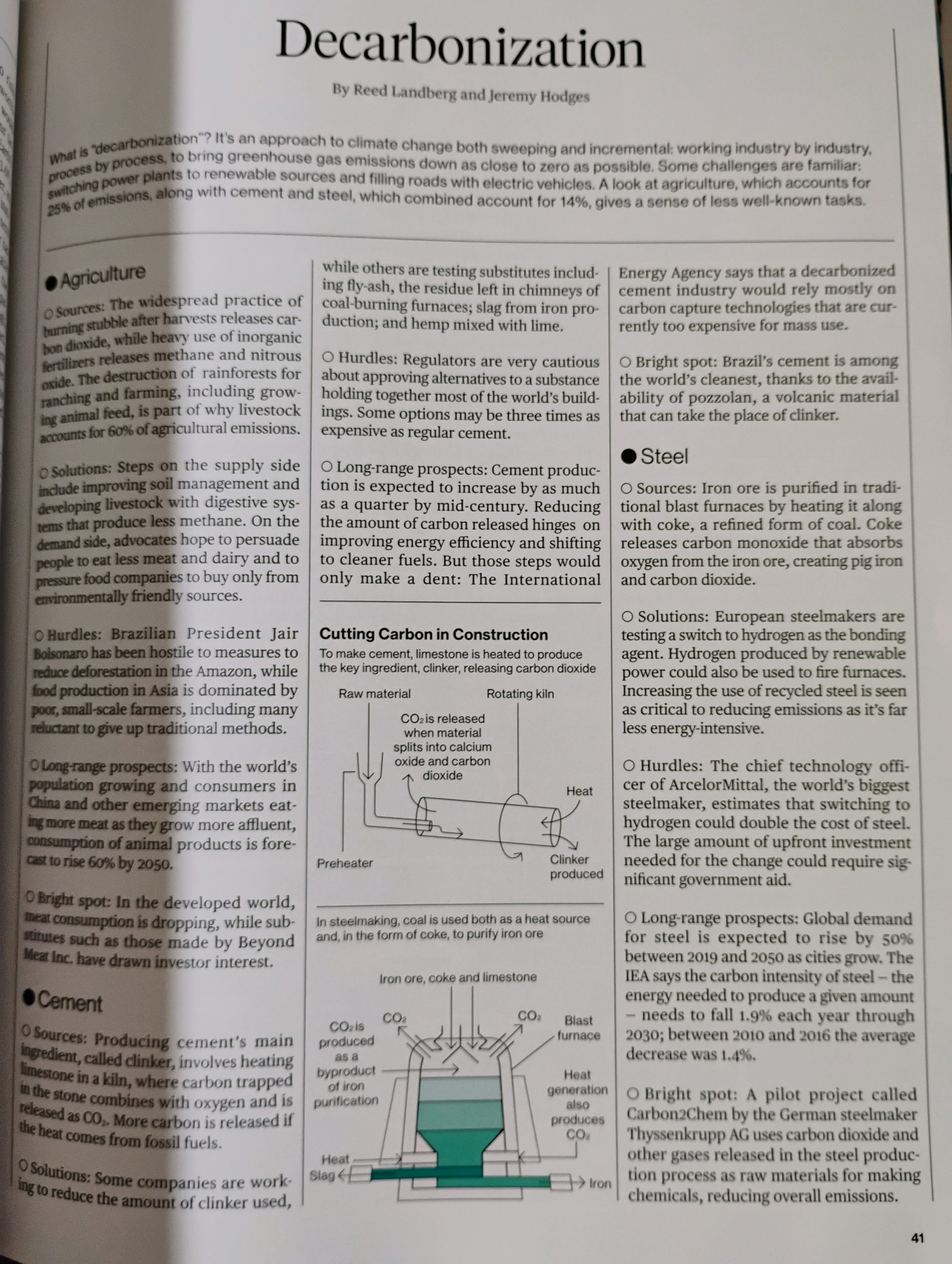
In the Decarbonization article, they broke it down by business sector, and then, within each section, had the same subheadings.
You can find copies of some quicktakes on Archive.
Author: admin
This is the server’s system administrator. This site is undergoing some changes.